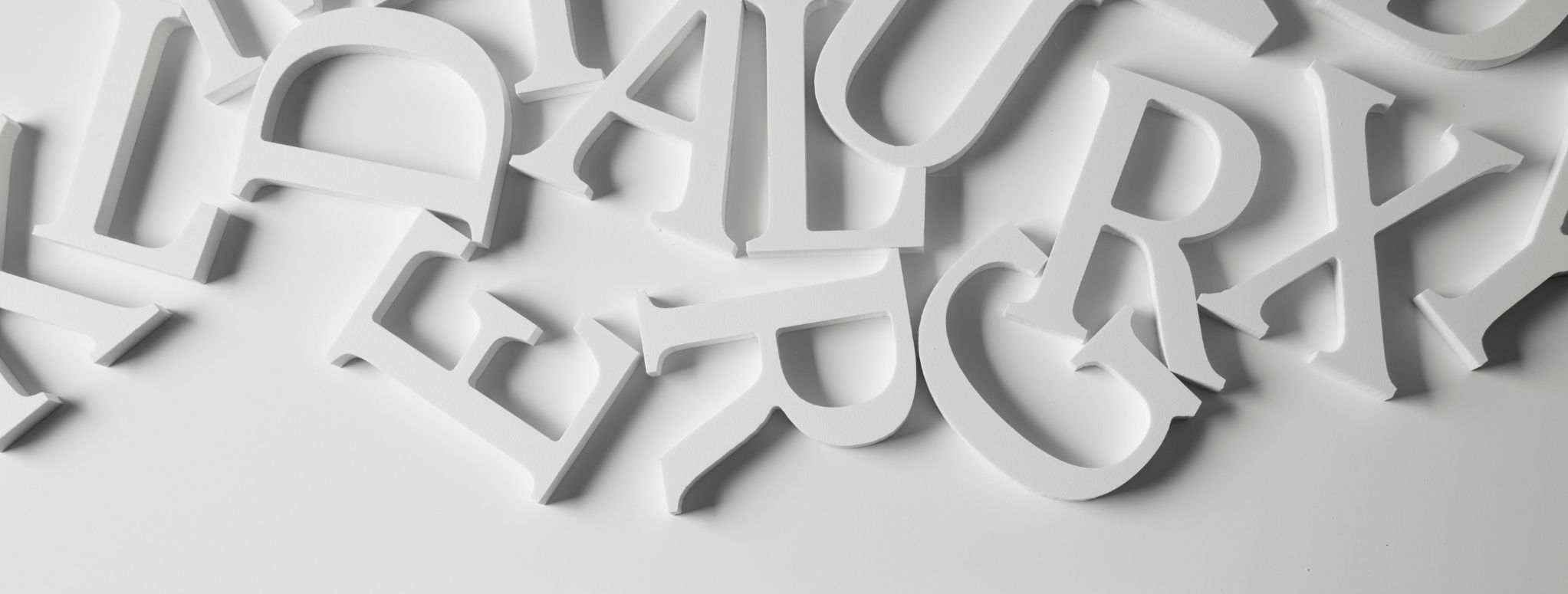
The Ultimate Guide To Font Pairing
When you are starting any design or a branding project, selecting the right font is one of the most critical challenges that you are faced with. It is the art and technique of arranging the type (letters and text) in a way that makes your design legible, readable, and appealing. It involves font style, structure, and appearance, which aims to convey certain messages and elicit specific emotions. Most projects require a font pairing of two or more fonts - for example, headline and body copy. However, finding the perfect combination is an intuitive art. Here, in this guide, we will tell you what makes a good font pair and how you can choose one? So, without any delay, delve below!
What Makes A Good Font Pairing?
Let's start from the very beginning - What is Google Adwords? In simple terms, it is a paid advertising platform falling under the marketing channel pay-per-click (PPC), where the advertiser pays for every click on their ad. Ads on Google are run via the Google Adwords platform. It is quite an effective method to drive interested customers to your business when they search on Google for products or services that you offer. A Google ad is perfect for everyone, no matter the size of your business or your available resources. It allows you to stay within your monthly budget and even stop or pause your ad at any point in time. How Does A Google Ad Work?
A great font pairing is extremely essential not only for a great design but also to create the desired impact. Good font pairing can be understood as something along the lines of a good relationship. The font needs to share some similarities, while also preserving its own individuality. You need to find two fonts that complement as well as contrast each other so that your design neither looks too simple nor too extravagant. Therefore, it is best not to select a font from the same family without any classifications as it won't provide any contrast and the design would be weak and a bit boring too. But different weights of a similar font can be used together, for instance, Sans Serif Bold can be paired with a light italic one.
In a good font pairing, there should be one font with a strong personality while the other one should be absolutely simple. So, make sure to not go overboard as two strong fonts will make your copy go out of sync with each other. Additionally, you also need to pay attention to legibility and readability in font pairings. If your design is too graphics-heavy, select a font that can be read and understood easily. On the other side, if the design is subtle, a strong font will look legible.
How You Can Select A Perfect Font Pair?
• Contrast font sizes and weight
When using a font, give attention to its size and weight in contrast to other font being used in the design. This will make the contrast more effective. There should be a safe difference in the sizes between the two fonts as it will help readers grasp the information easily. It will make reading the content of your website, blog or copy, a stressless exercise. Moreover, the different font sizes can help you create a visual hierarchy - make the important information in a higher/heavier size. Font weight is also as much important as the font size. You should use bold, heavy, and perhaps black fonts for the title and contrast it against a light font for the body. This will help take your viewers’ attention towards the catchy headline.
• Make use of the font from the same family
If you don’t have enough time to compare different font combinations, then you can make use of the fonts from the same family. It is a sure-shot way to get the perfect font pairing. Some fonts are members of the “superfamily” which means that they come with a selection of different styles, weight, and classifications that are specifically designed to blend together. So, what you can do is select the right font of the “superfamily” that conveys the personality and messaging of your brand. Then you can use its different classifications that compliment as well as contrast each other. When you make use of the fonts from the same family, you can never go wrong!
• Always use a limited number of fonts
It does not matter what kind of design you are creating, whether it is for your website, your social media, your blog, or some other collateral, don’t go overboard with the use of fonts. To make your design visually appealing and interesting, don’t use too many different fonts together as it will make your design look confounding. Make sure to use two or three fonts for a single project, however, you can break this rule when there is a demand for multiple fonts. In that case, also make sure that all your fonts blend together to help in achieving the overall purpose of the design.
Basically, font combination in graphics design serves the purpose of reflecting your brand personality. It also helps in delivering your brand message to the audience, consistently. Therefore, if you get it right, then your design will look dynamic and will serve its purpose. But if you get it wrong, your design will look messy and take you down with it. So, choose wisely and carefully, keeping the above information in mind, and you will make the right choice!